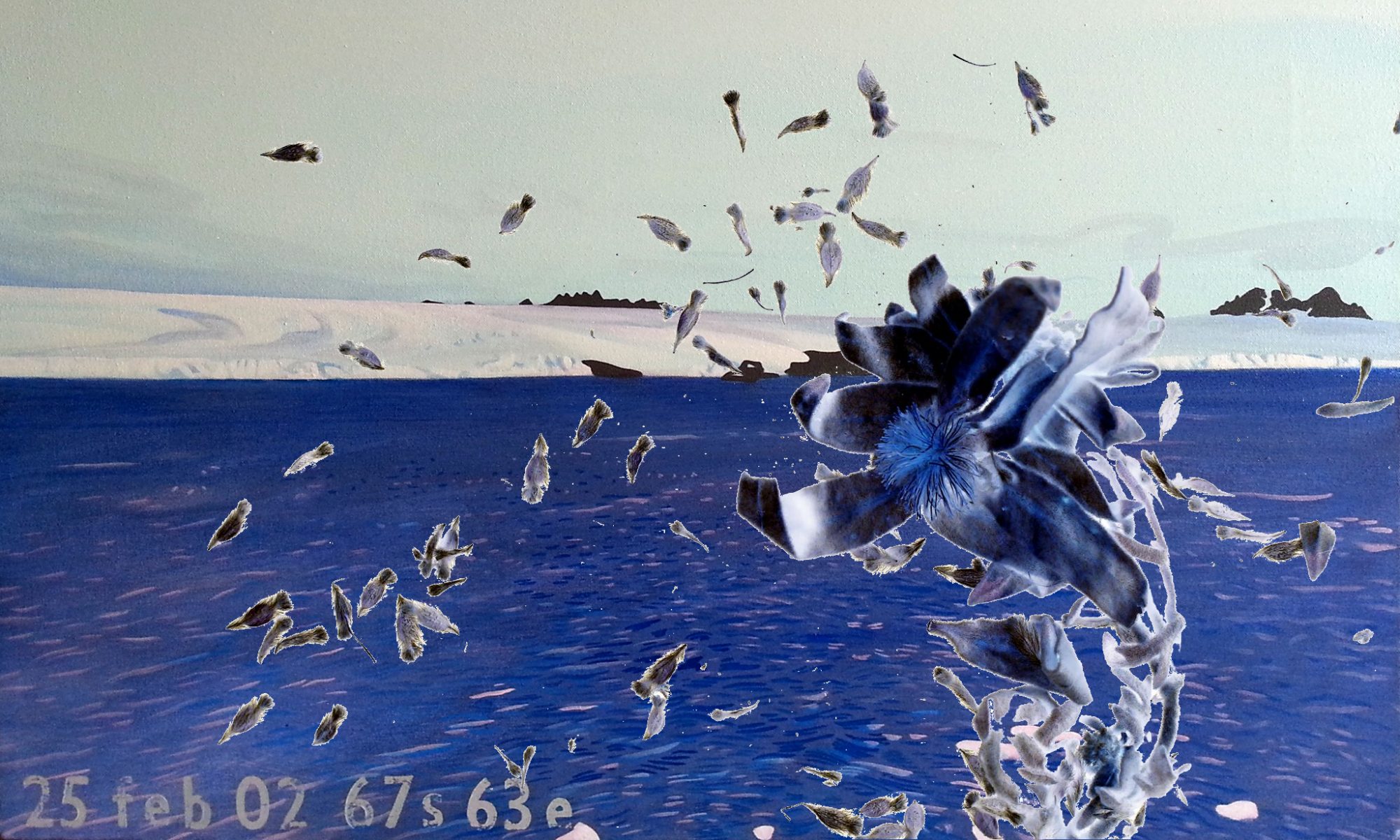
Exploring ways to tell stories of Antarctic journeys, I am designing a new space within AntarcticAnimations.com.
It is wide and white, like the Antarctic continent in summer.
Essentially, this is a different style sheet.
Testing this with existing (static) material from my own 42 days journey, I realize that to represent a year-long journey, several style sheets may need coding, to move readers through the light and darkness of the seasons. A simpler solution would be better.
