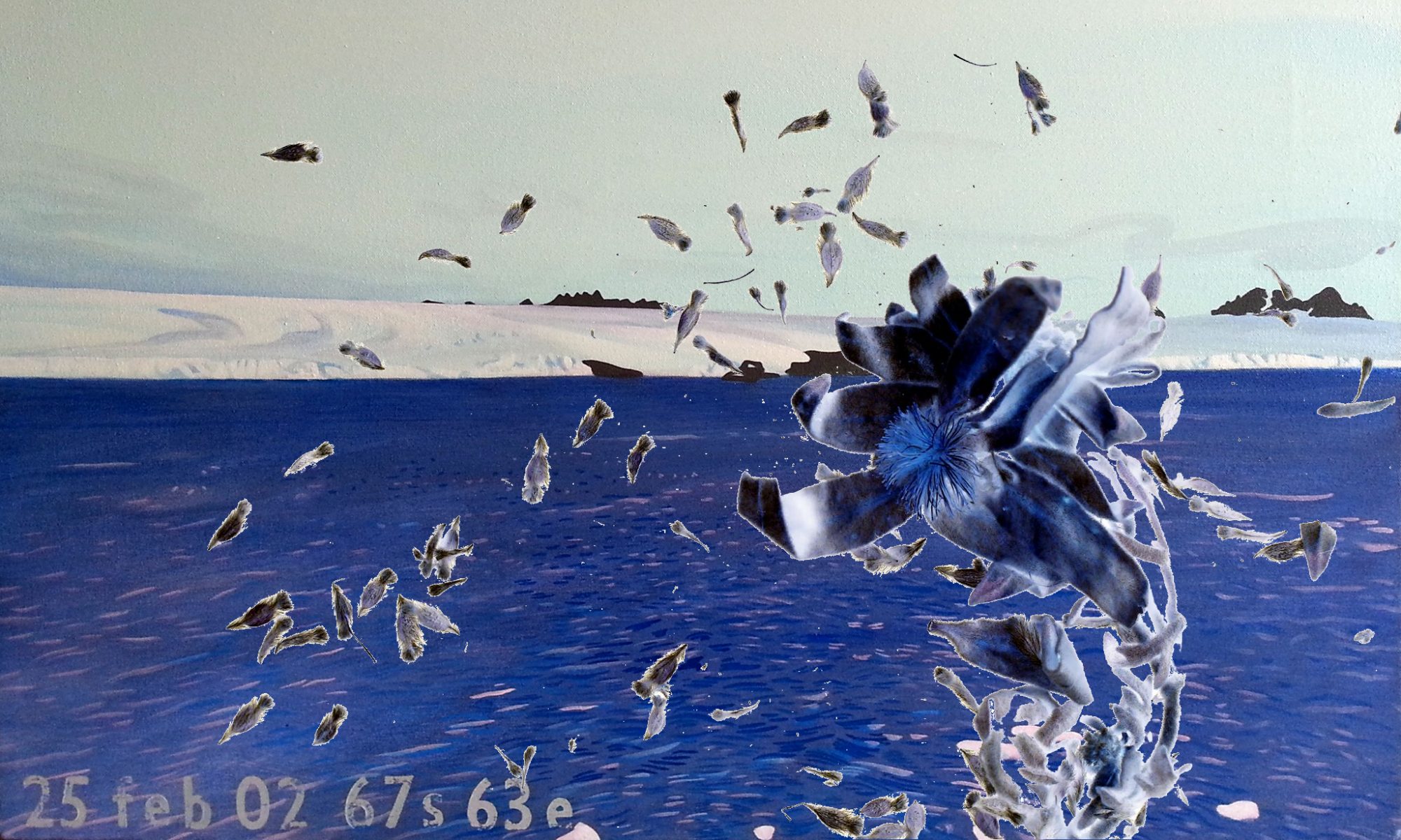
Exploring ways to tell stories of Antarctic journeys, I am designing a new space within AntarcticAnimations.com.
It is wide and white, like the Antarctic continent in summer.
Essentially, this is a different style sheet.
Testing this with existing (static) material from my own 42 days journey, I realize that to represent a year-long journey, several style sheets may need coding, to move readers through the light and darkness of the seasons. A simpler solution would be better.

Dear Lisa
From a usability perspective you might consider changing ‘No comments’ to ‘comments’. It is quite a conceptual leap to press ‘No comments’ when you want to comment.
I like the idea of light and darkness. I wonder how you can apply style sheets selectively?
I agree about changing the default ‘No comments’ to ‘Comment’. I’ll have a poke around the backstage WordPress files through Cpanel and see what I can do.
Style sheets can be individually evoked for individual .php files, if you want them to have different values from each other. It’s just a matter of writing these .css files files, each defining a such things as background and font colour, and referencing them in the .php files. I would also need to define font colours to accompany these different backgrounds, so they remain readable. And line-art animation files made for these pages will need to have exactly the same background colours too, to read them as lines only